And now, for the next step in my Comics Process (this process seems really long, doesn't it?): Computerizing! This is going to be pretty mind-numbingly detailed in terms of what to click next, so make sure your caffeine is at the ready.

First, I scan my inked page.

Because I have a regular-sized scanner (this one in fact), I have to scan my page in 2 pieces.

Next, I open my scanned pages with Adobe Photoshop. I use Photoshop for the computerizing process mainly because it's something I've become so accustomed to doing, so therefore it's fastest for me. Over the years I've come to know Illustrator and InDesign better, and I know other comickers have other programs they prefer, which are probably better to use for this kind of thing. So just as a disclaimer - I use Photoshop because at this point I can use it faster than I can other programs. Anyhoo.

My page comes in 2 pieces, so I need to rotate my images and combine them into one page. I go to the top menu > Image > Rotate Canvas to get each part facing the right side up. Then I pick one of the halves and go to Image > Canvas Size.

I set the height of the page to 14 inches, because that was the size of my original paper. I select the other half of my page, copy and paste it into this one, and fiddle around with the layer until they match up. Then I combine them into one image by going to Image > Merge Visible.

Next, I need to put borders around all of my panels, since I didn't ink them in. I select the Rectangle Tool from the handy toolbar and draw one big rectangle along the outside of my entire page.

Then, I go to the Layers Panel and set the fill of the rectangle to 0%, so the rectangle is transparent. Then I add a Layer Style to the rectangle - a stroke 12 pixels thick, which gives us the panel outline.

Now that the outside of all of the panels is marked, I need to separate each panel border. Using the rectangular marquee tool, I draw rectangles for all the gutter spaces (in between the panels). Make sure when you use the rectangular marquee, you've clicked the Add to Selection button so that all of your selection is included.

Next, go to top menu > Select > Inverse. Then, back in the Layers Panel, click the Add Layer Mask button.

Voila - by drawing that one big rectangle and cutting out the parts I didn't want, I've successfully created all of my panel borders for the page.

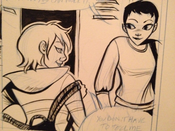
The next step is going to be adding text. Since my scanned image carries traces of my blue pencil, I can still see the word bubbles and what text I want to type in on the page. Now, you have some choices when you're adding text in on the computer. I would beg you, however, not to use Comic Sans as a font. It's been used everywhere, it's tacky, and it's a bit ugly. There, I said it. Besides that, I would say it's up to you what you choose for a font. However, in my opinion, one of the best things you can do if you're not hand-lettering (or getting a professional to do it for you) is to create your own font. Even though I'm terrible at drawing fonts by hand myself, I struggled through the process and managed to come up with one that isn't horrible, is legible, and 100% reflects me and my style. I used this font creator back in the day ... like, at least 9 years ago when I created my font. Yeesh. I'm old.

So, using my font, I type over the word bubbles on the page. For words I want to emphasize, I select the text and go to the Character panel and hit the Faux Bold or Faux Italic buttons. When I created my own font, I created a "bold" version of it too, but I usually prefer to use the Faux Bold instead of my own font (again - not gifted at font creation).

Now that all the text is in, I can create the word bubbles to go around them. For this, I go to my Shapes Tool and select Rounded Rectangle. I set the radius (curvy-ness of the shape edges) to 50 pixels.


After I've dragged rounded rectangles behind each of my text bubbles (make sure to set the properties of the rounded rectangle tool to Add to Shape Area so the shapes all end up on one layer), I can create the stem that points the bubbles to the speaker. For this, I select the Pen Tool.

Using the Pen Tool, I select the rounded rectangles layer in my Layers Panel, again making sure the selection properties on the top panel are sent to Add to Shape Area. What this does is insure that the stems I create with the pen tool will be treated as part of the same shape as the rounded rectangle, so there won't be any lines or separation between the word bubble and the stem coming off of it.

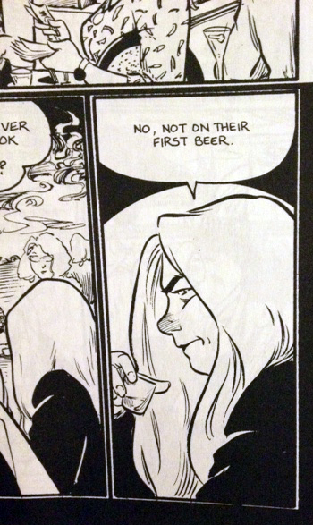
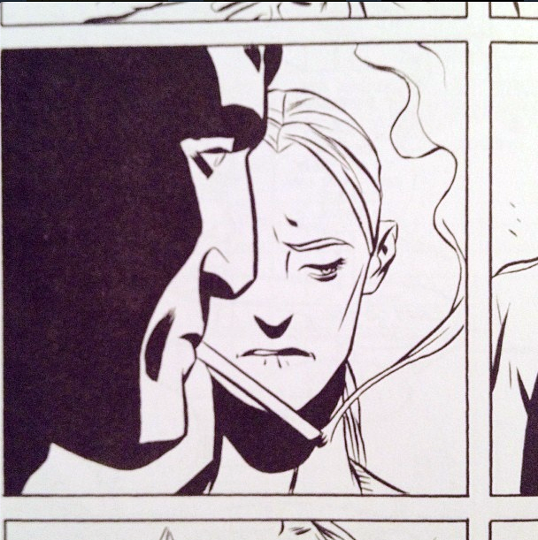
Now, a word on word bubbles .... I don't terribly like the way I do them. In fact, I tend to prefer word bubbles that look more like this:
(This page is taken from Hopeless Savages #3 from Oni Press, art by my fave Christine Norrie, story by Jen Van Meter, lettering credited by Christine Norrie, Andy Lis, Jamie McKelvie, Tom Orzechowski, Bryan Lee O'Malley)

So this is something I definitely need to work on.
Next - on to getting rid of the pesky blue pencil marks. I forget who exactly I got this process from first, but it's proven to be quick and handy, so I thank them! With your artwork layer selected, go to Image > Adjustments > Hue/Saturation.

Select the Blues and set the Lightness to 100. Repeat the process with the Cyans selected.


Now, your blues are gone but your inking still looks a little ... drab. I little bit less than pure black, doesn't it? Easy fix. Go to Image > Adjustments > Threshold.

And hit OK.

That should bump up the contrast of your inks to a nice level.

So there you have it - the whole page!
Now, for follow-on things you can do - to get rid of the lines that go outside the panel borders, select your panel layer (the one with all the black panel borders) in the Layers Panel, right-click on its mask selection, and select Subtract Layer Mask from Selection. Apply this selection as a mask to the layer your artwork is on. Also, you'll need to select the outside border of your panels and go to Select > Inverse. Select your artwork layer again and go to Select > Save Selection > Channel > Shape 1 Mask > Operation > Subtract from Panel. What all of this does is mask your artwork layer to be within the same boundaries as your panel borders - i.e. none of your lines will bleed outside of the panel border lines.
Still awake? You've made it through my computerization process! Yay! Now, there's all kinds of places you can go next - adding grays to the page, color, etc. However, my page is going to stay this simple for now, as you can see posted here. If anyone has any further tips, suggestions, preferences on this process, lemme know! Let's have share time. :)
Past Parts:
My Comics Process Part 1: Thumbnailing
My Comic Process Part 2: Pencilling
My Comics Process Part 3: Inking
[otw_is sidebar=otw-sidebar-4]


